American Icon Brewery
I’m excited to present some of the projects I’ve been working on with a microbrewery from my home state! AIB had been looking for a fresher take on their rebranding coming into the tail end of 2020 and the beginning of 2021, and approached me for an edgier indie vibe.
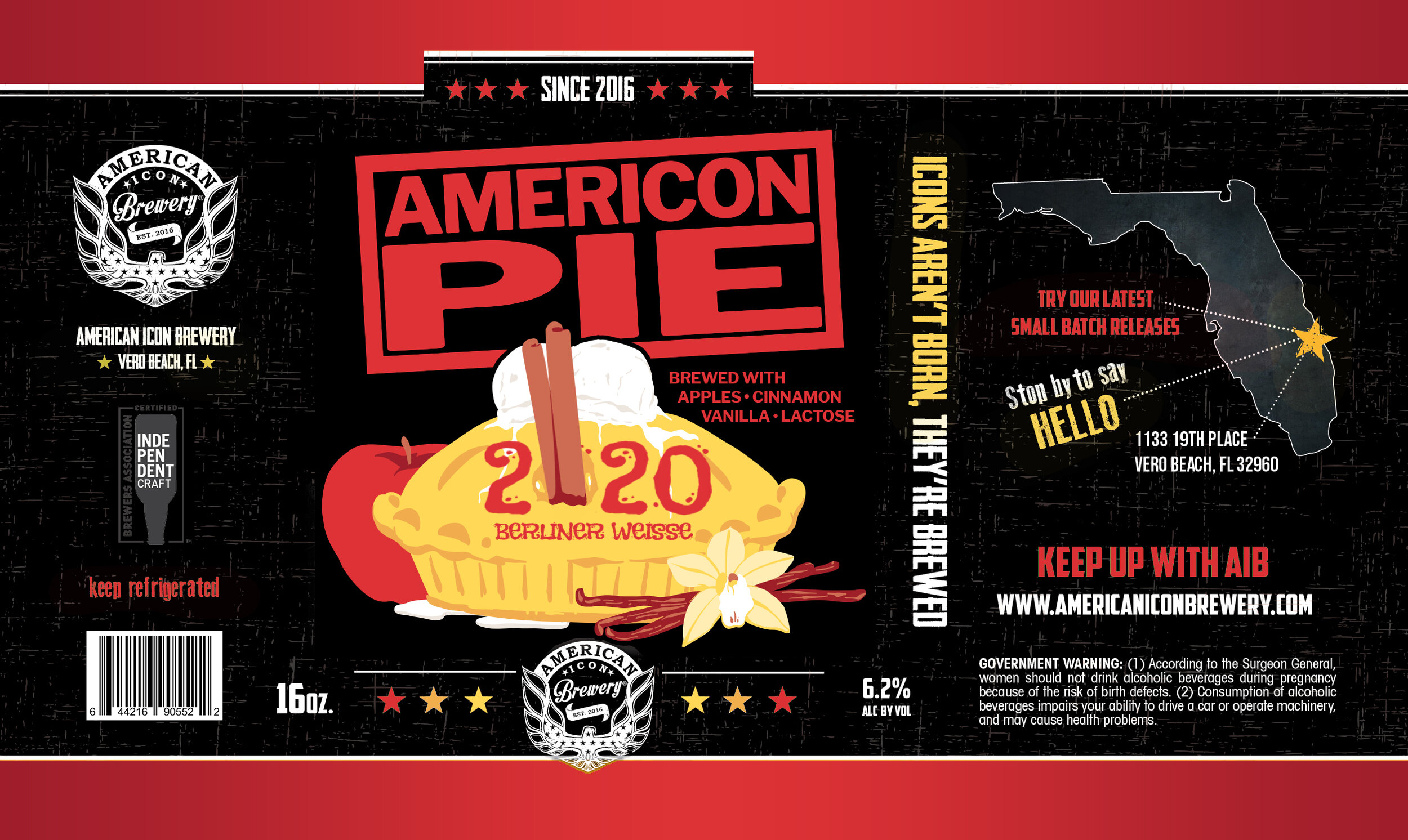
AmerIcon Pie Label
I was first approached by American Icon Brewery to illustrate a label for their new 2020 Berliner Weisse dubbed “AmerIcon Pie.” They wanted a label inspired by the American Pie movies, with similar visual themes and title as the posters and a fall colour scheme. This was a rush project, and the needed it within the week to meet the deadline with their printer. With the information they gave me, I created two rough mockups using their established branding and label template for their previous labels.
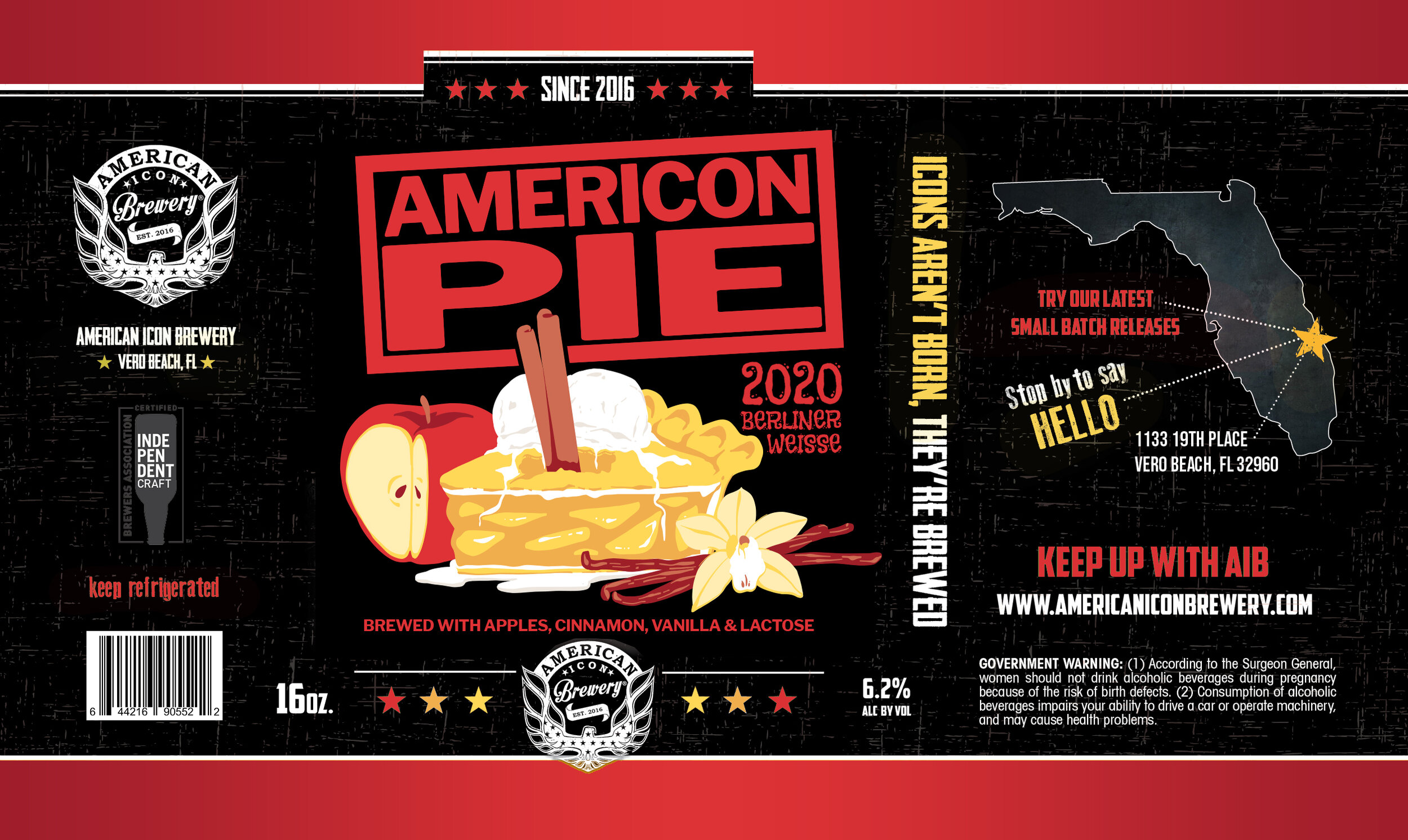
Updated Draft
For the updated rough mockup, the cinnamon sticks were removed from the hole and the opening and apple filling were made more obvious. I also opted to keep one of the apple slices from the pie slice concept to further push the apple notes of the beer.
Initial Sketches
After review, they preferred the original whole pie concept since it had the most visual similarity to the movie poster, but asked if I could make the hole in the pie more obvious.
Final Print
They did like the visual joke of the cinnamon sticks in the hole, so they requested that I put them back. They also requested that I adjust the colour palette to have more brown tones. With these edits in mind, the following label was approved and moved to print:
I added more detail and cleaned up the image, with added texture to match their branding. The sketches and final illustration were created in Adobe Fresco. Title and subtext were added and edited in Adobe Photoshop. Final label template was edited in Adobe InDesign.
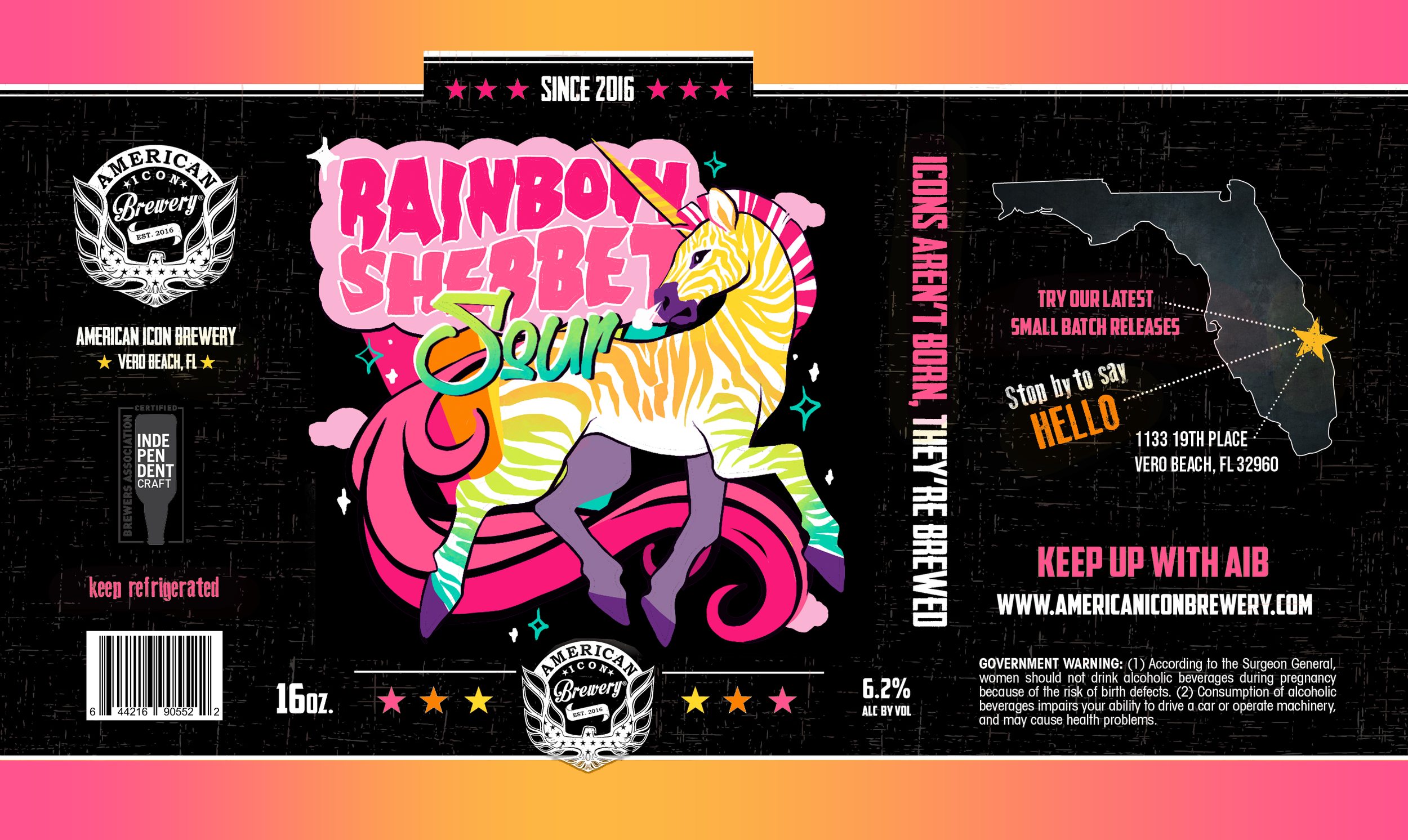
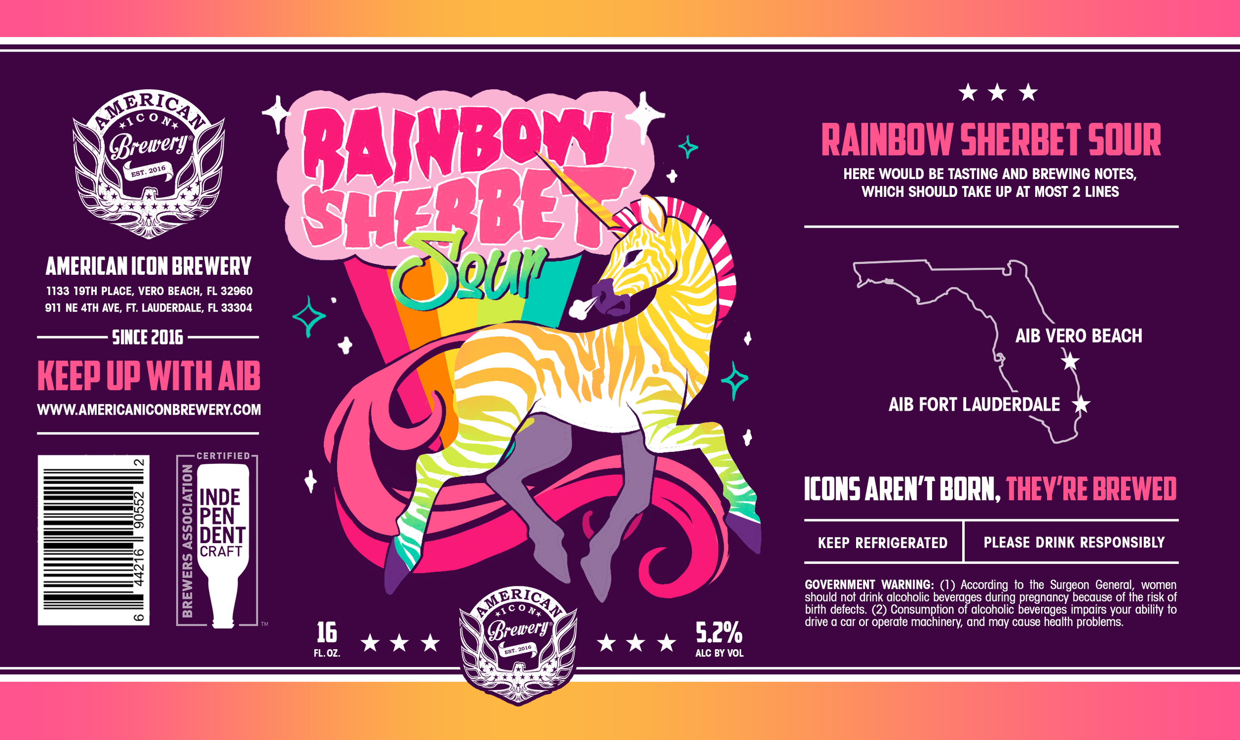
Rainbow Sherbet Sour Label and Updated Label Template
Approved Updated Label Template
The final label template was approved with a few adjustments. They asked for their logo with the lines and stars to stay in the same general area, and to continue changing the colour of the stars according to the art palette. I also repeated this detail in the accent stars on the information ribbon, while keeping the stars white at the top of the ribbon to keep the branding more coherent for when different cans are lined up next to each other.
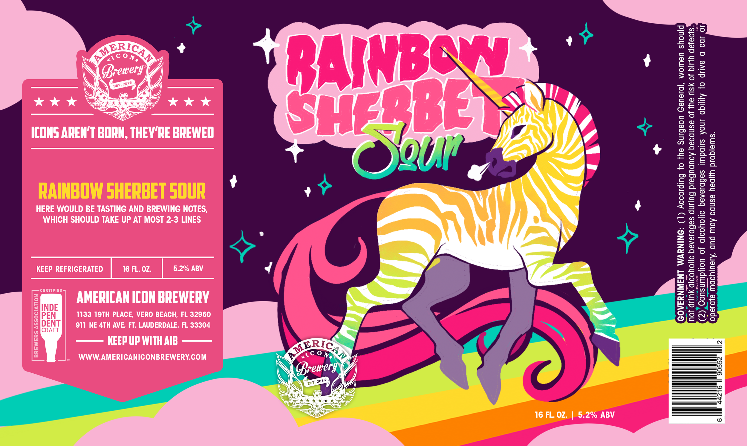
Initial Drafts
I was approached again for their next seasonal label, as well as 3 proposals for a redesigned label InDesign template. They were looking to clean up their branding and a wrap-around use of the art area. I used a sketch of the new seasonal design as an example for how the label across the different layouts. They also asked how it would look if they decided to stick to their original template, and if their original template was only slightly refreshed.

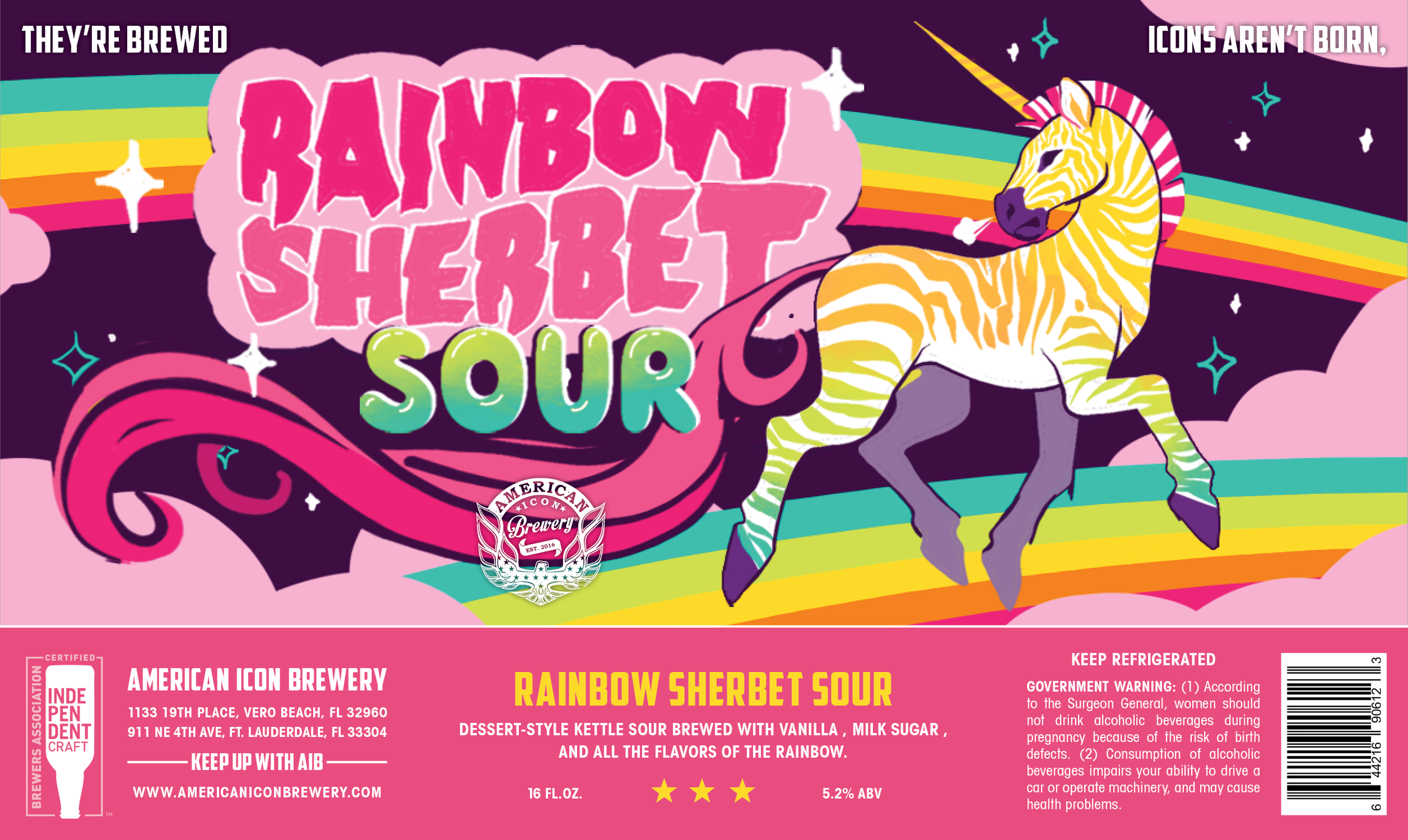
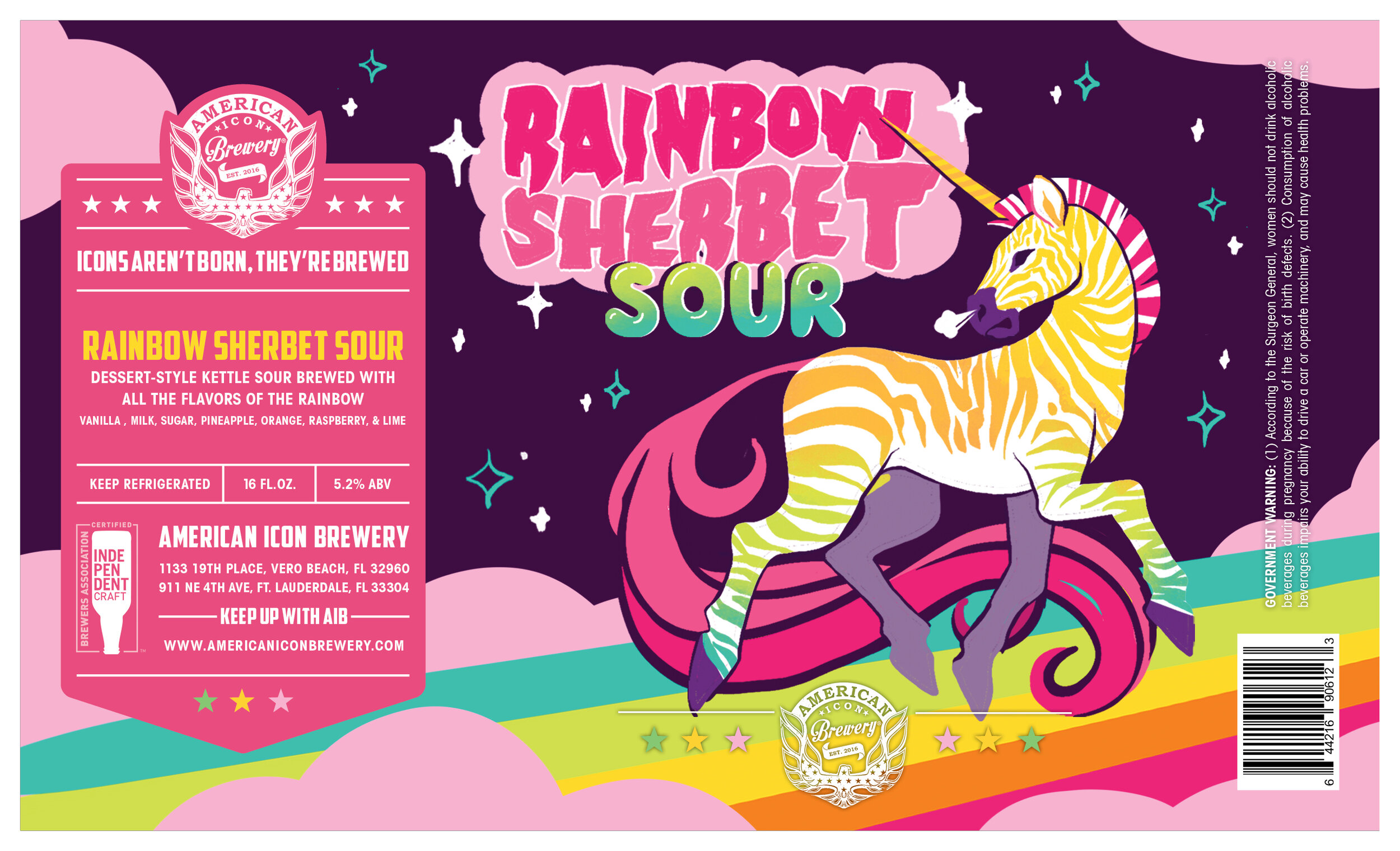
Final Print

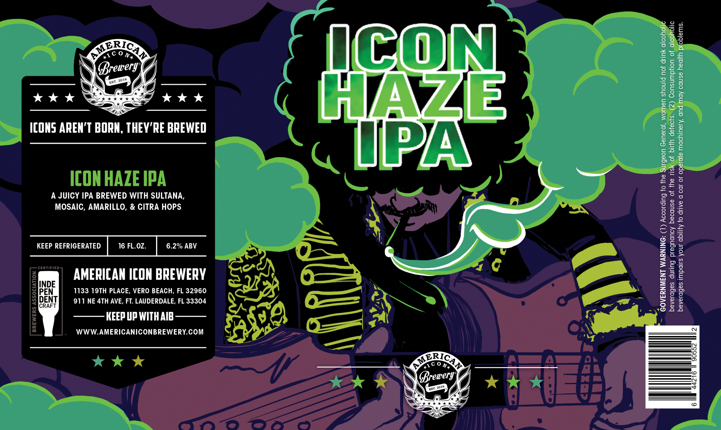
Icon Haze IPA
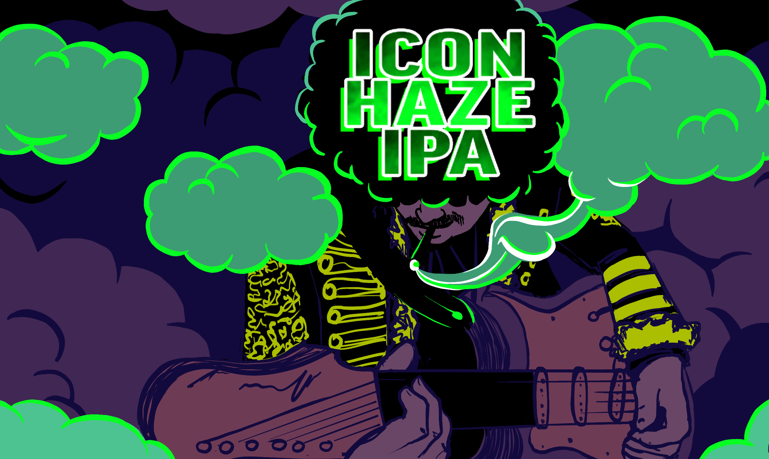
Icon Haze IPA is one AIB’s established and recognized beers on tap, so the team already had a clear idea of what they wanted for an updated label. They were adamant that the original typography would stay on the label since it already exists on the beer tap handles and various other instances that would be too costly to change. They also wanted to keep the previous allusion to Jimi Hendrix and the green hues.
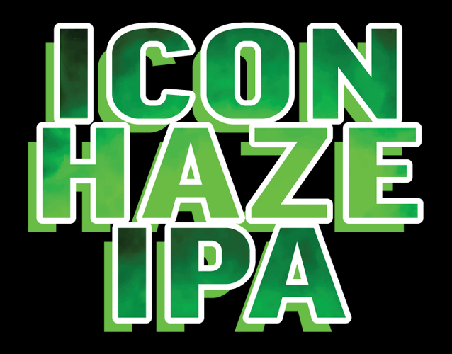
The screenshot of the original branding that was sent to me in the brief, and the final SVG file with colour optimized for print. They no longer had the original files of the label nor the typography, so I recreated the type in Illustrator. With a vector format now on file, they were able to use the typography for a shirt a few weeks after the final label was sent to print.
The concept stages and final delivery timelines for Rainbow Sherbet Sour and Icon Haze IPA overlapped, so I suggested presenting the team with an initial concept for both, then focusing on Icon Haze after the new label template had been worked out using Rainbow Sherbet.
Initial Concept and Updated Sketch
Because the concept was to be presented at the same time as the Rainbow Sherbet, the original sketch was integrated into the original branding. My main goal for the concept was to showcase the key elements of Hendrix’s silhouette that would transition into an updated rough draft after the template decision (hair hiding facial features, left-handed guitar playing pose, and his signature jacket). The team loved the concept, but wanted to push the “haze” theme more. For the rough draft following the template decision, I added in smoke and purple hues to allude to Hendrix’s song “Purple Haze.” I also took this opportunity to optimize the pre-existing green hues in the typography for CMYK printing, and adjusted the rest of the palette accordingly.

Final Label Design
After presenting and refining the cleaner version of the label after several review sessions, the team decided on using the original rough draft for the final print of the label. They loved the energy it gave off in comparison to the cleaner line art of the final draft. While I was a bit disappointed that we couldn’t use the cleaner design, I’m happy to have still created a something they were so attached to.

Florida Heat Sour Ale
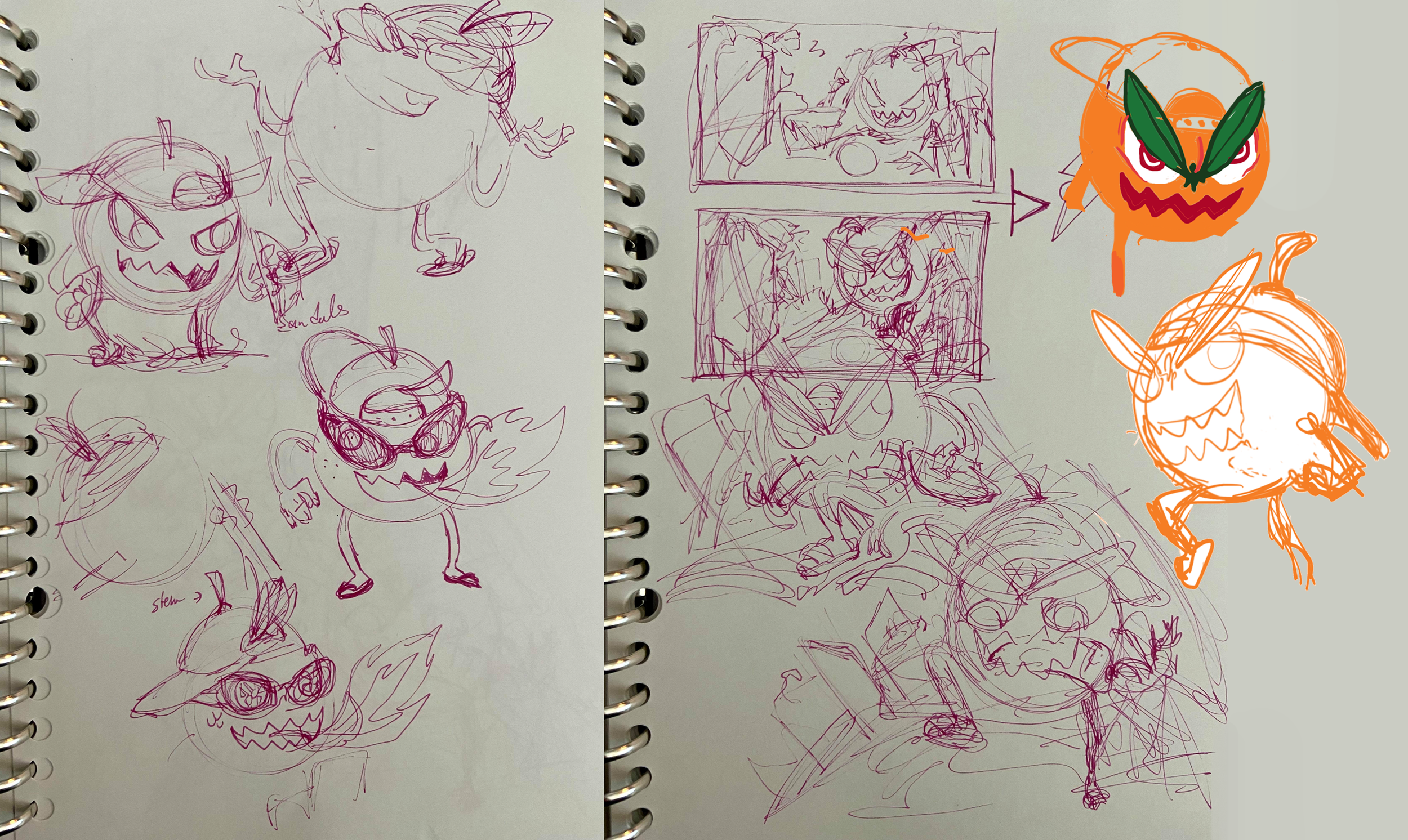
Initial Sketch & Reworking of Concept
The brief for this label was to be for an aggressive Florida-themed mascot with either the West Palm Beach or Fort Lauderdale skyline as the backdrop, showcasing the blood orange and chili pepper ingredients. I wanted to go for a B-movie feel with the mascot “terrorizing” the city, which was received well and approved. I originally went with a “beach bro” American gator for the mascot/kaiju and the West Palm Beach skyline, but upon revisions it was decided to be an orange with Fort Lauderdale as the backdrop instead. I decided to flip the position of the original mascot to have him emerging from the ocean, to give off a more refreshed impression to compliment the beverage aspect.
Final Label Design
I was initially skeptical of using an orange as the mascot since I wanted it to be clear it was specifically a blood orange, and slicing it open wasn’t producing the result I had hoped. To circumvent this, I gave the mascot blood orange slices for pupils, and made his mouth similar shades of deep red. I also wanted to show more of a fusion between the blood orange and the chili pepper, and I thought just having the mascot holding the chili pepper would give the impression that there’s only a touch of spice in the brew. To keep the flavour to scale, I made the hat into the top part of a chili pepper. To further bring in the heat, I set Fort Lauderdale on fire in the background. I also decided to tilt the perspective to give the scene more dynamic movement.
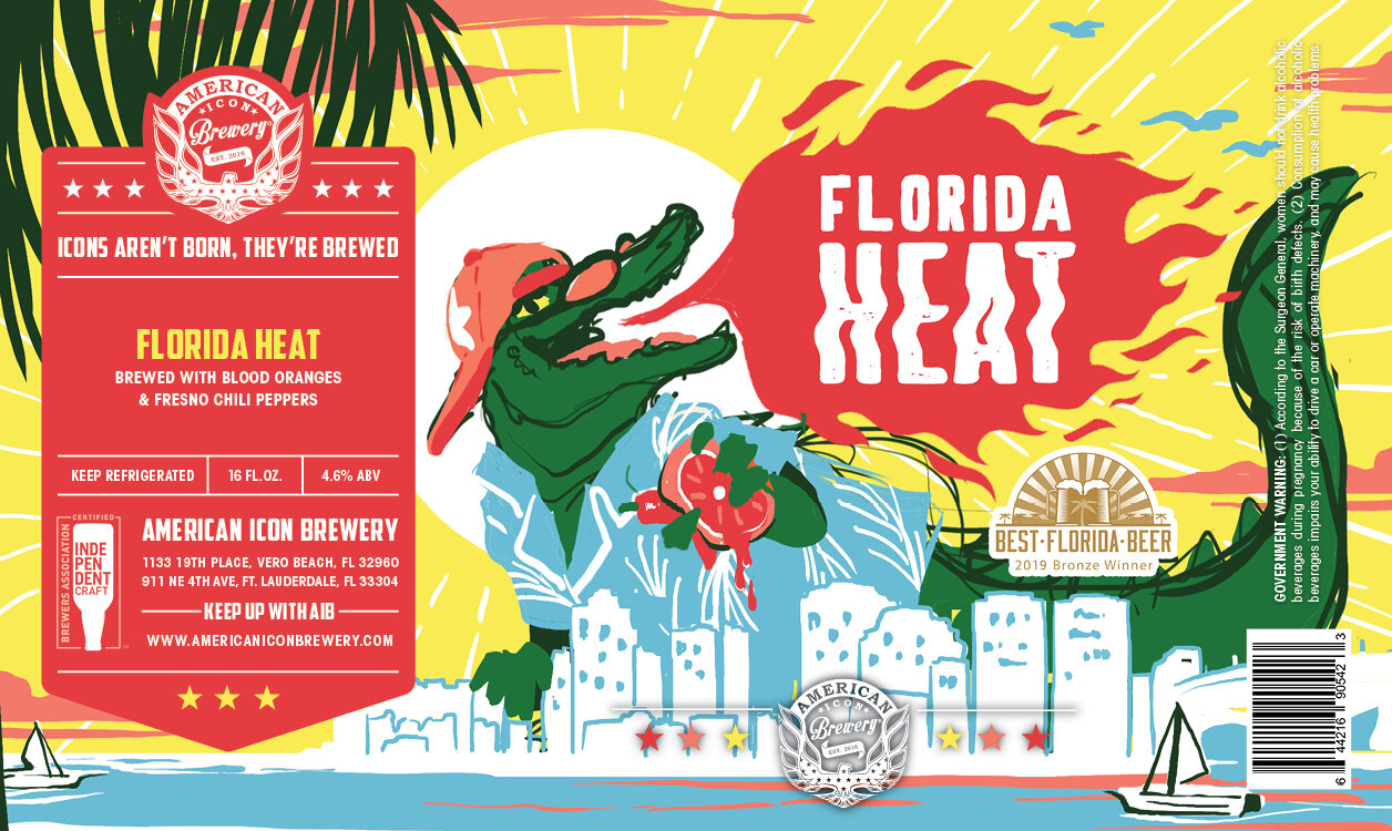

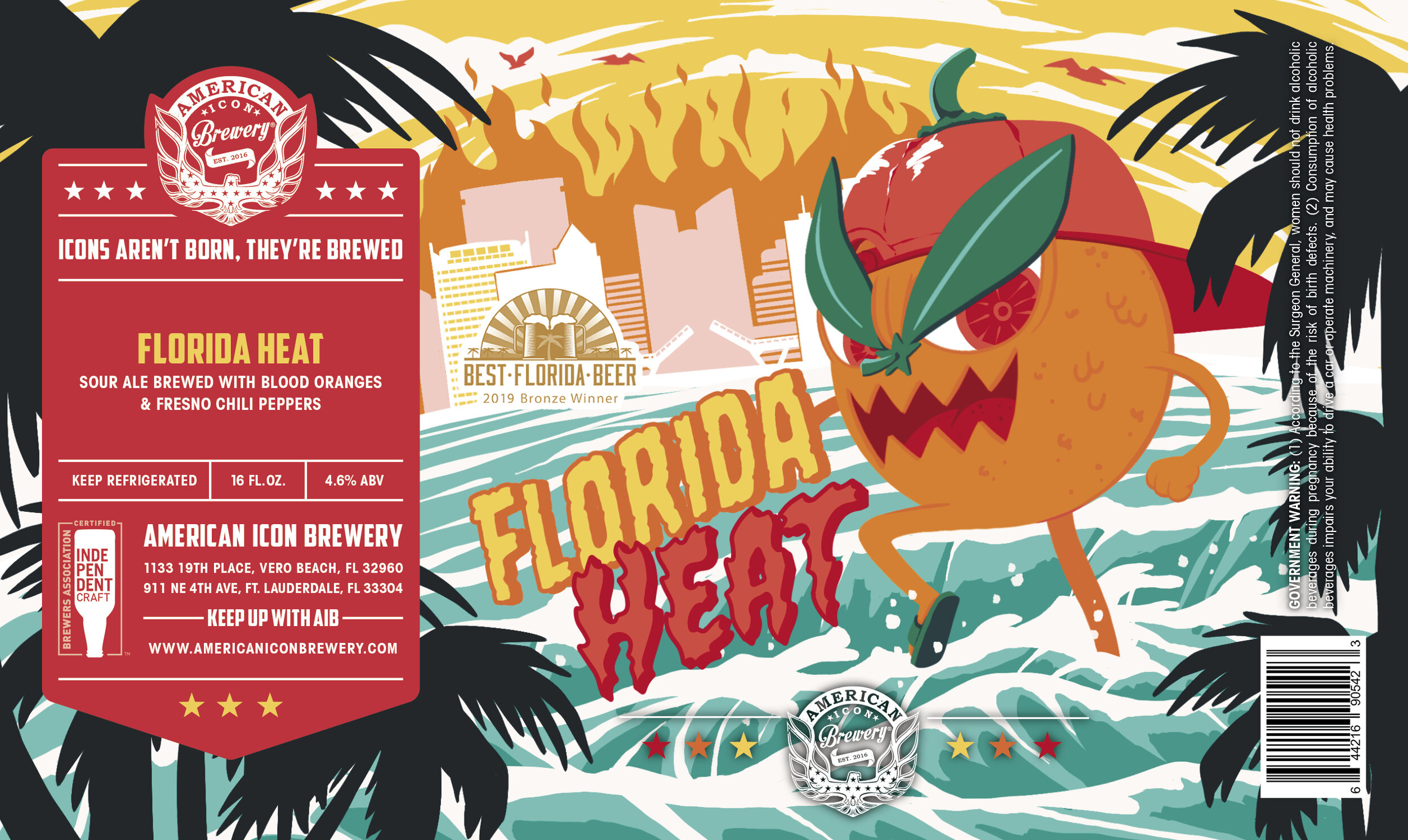
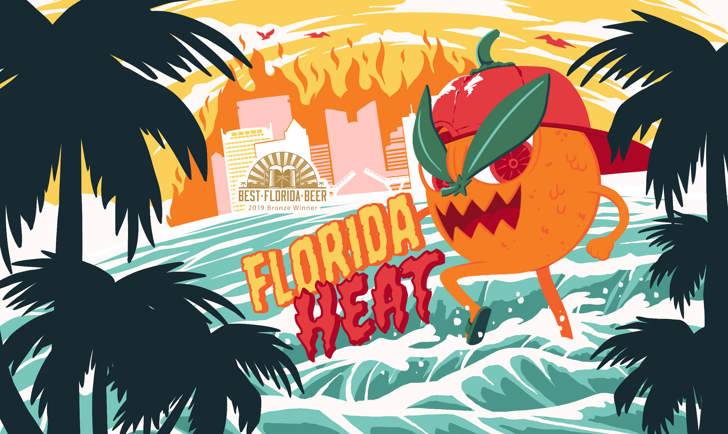
Final print on the brew in a 3-can turnaround and nestled on the beach, posted by American Icon Brewery’s social media team.
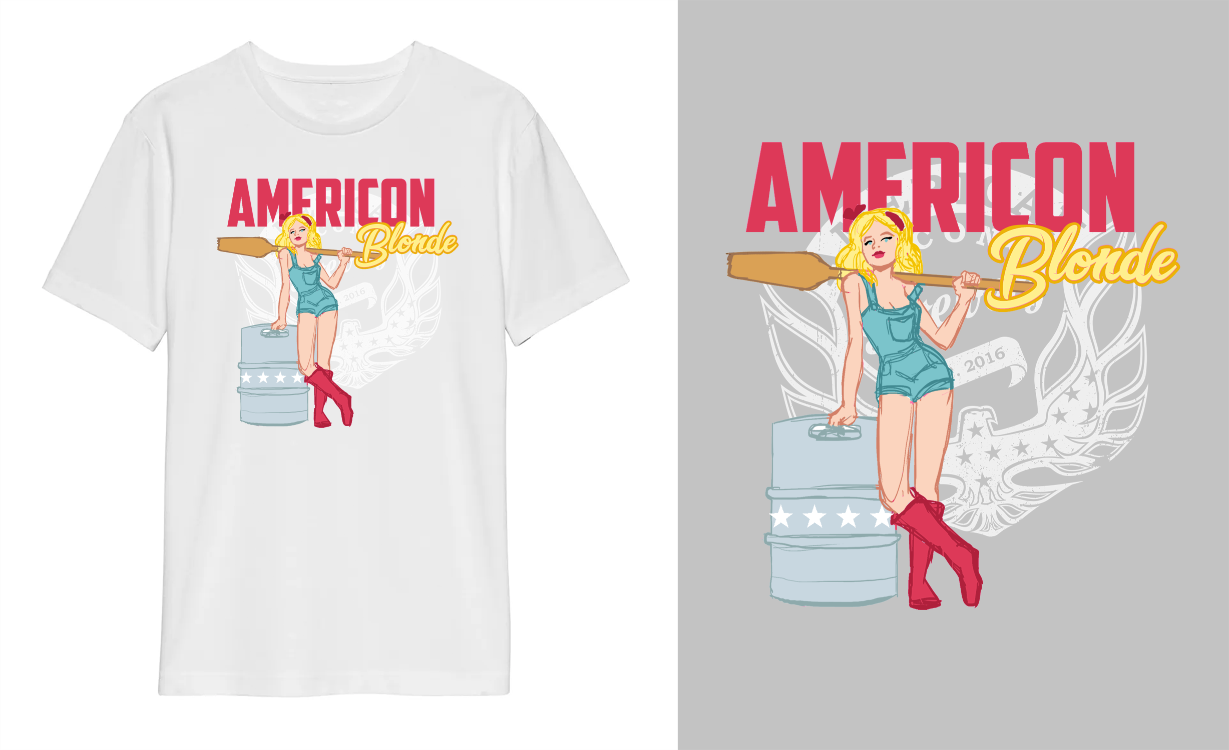
AmerIcon Blonde Ale T-Shirt
AIB had been wanting a pinup style to represent their blonde ale. While they weren’t ready to have a label for the brew, they did want to have a t-shirt to add to their shop. They specifically wanted a blonde factory woman in rubber work boots and her mash paddle in a classic pinup pose.
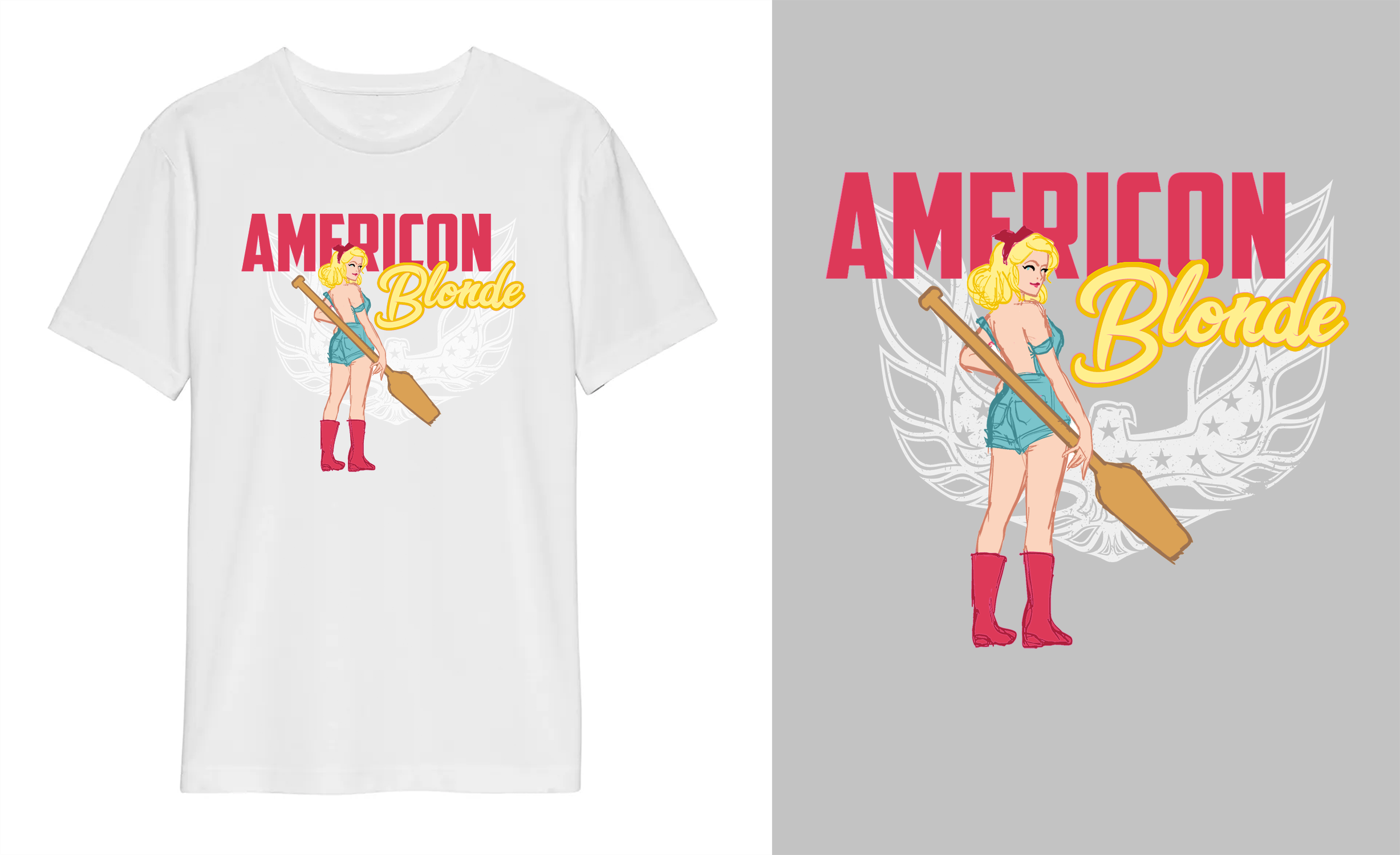
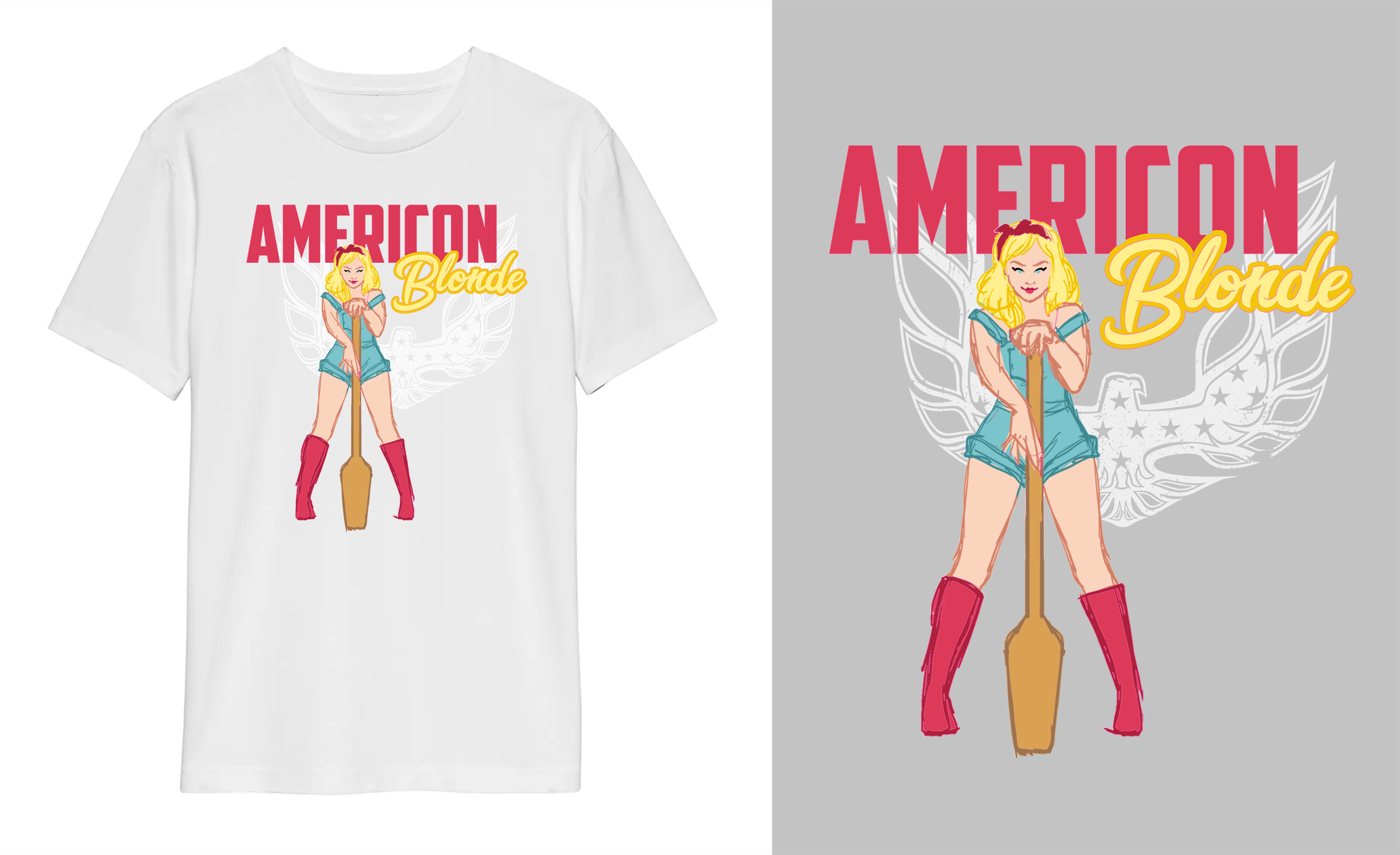
Initial Pose Sketches
Because I knew ahead of time what the end consumer product was going to be, I did my sketching on a t-shirt mockup. Her design is inspired by Marylin Monroe and Americana pinups from the 1940s. I presented several different poses for them to choose from, and we settled on the pose of her sitting on a keg.

Final T-Shirt Illustration
To make sure that it read “Amer-Icon” and not misspelled “American,” The type was separated and given complimentary colours in the American spirit. I also drew fine hair texture onto the font for “Blonde.” While the illustration itself is painted using flat shapes of colour like the labels, I wanted to give it some vintage-feeling texture to push the pinup concept. I found middle ground by only using texture for highlights and shading with only minimal spot colours. For example, her overalls are a flat shade of blue, with highlights and seam detail of light blue and white where the light would be the most severe.